SLC-IT
branding for Snow Leopard Conservancy – India Trust.
Refreshing the brand identity for the Snow Leopard Conservancy-India Trust (SLC-IT) was not only an immensely satisfying job but a great honor too. The Snow Leopard Conservancy-India Trust is an independent NGO based in Leh-Ladakh, dedicated to protect the endangered snow leopard in the trans-Himalayan regions of Ladakh. The objective of the project was to create a distinctive identity for SLC-IT to generate awareness about the endangered species and its correlation to a healthy habitat and ecosystem. And help spread awareness to a wider audience by various cost effective ideas.
LOGO
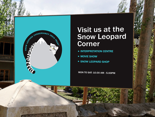
The idea was to depict the correlation of the conservation of the snow leopard to its environment. I used the most distinctive feature of the snow leopard, its large thick spotted tail around the snow capped Himalayas depicting its correlation to its habitat. The head peeping shyly from the other side captures its very elusive nature. Brand colors are borrowed from nature; blue symbolizes the snow, sky & water and the natural green is also the color of eye of the snow leopard.
LOGO FOR SIZE BELOW 5 CMS
LOGO IN B/W FOR SIZE BELOW 5 CMS
BRAND FONT AND COLORS
STATIONERY: As the other idea, we printed the spotted tail on the reverse of the letterhead. The idea being that on making 3 folds of the letterhead, the tail would go upright on the last one. So when the receiver pulls the letterhead from the envelope, he would be greeted with an upright tail, which signifies that the sender is “pleased to meet you”.
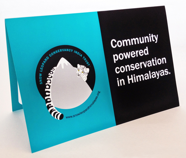
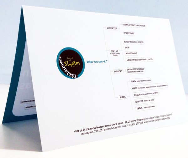
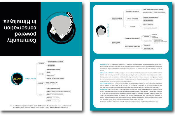
BROCHURE: Our brief was to create an economic single fold brochure for SLC-IT. The objective was to create quick short guide to introduce SLC-IT, what it does and what you can do for them. SLC-IT believes that sustainable conservation is best possible with the participation of local community. The cover of the brochure highlights that belief, opening inside to a chart that at a glance tells you what SLC-IT does. The back cover tells you how you too can be a ‘Friend of Shan’.
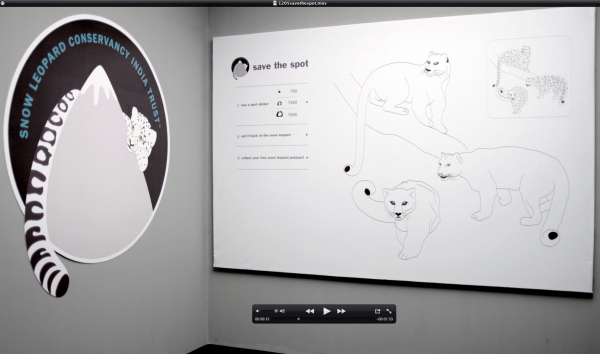
SAVE THE SPOT: Save the Spot corner was a fun activity first held at LIFF 2012. STS corner had large cutouts of the snow leopards put up on the wall, without their spots signifying the decline of the endangered species. We made stickers of the spots in 3 different sizes, each at different price value. All you had to do was buy a sticker of the spot and put it on the snow leopard. The idea was to involve people in some kind of a physical act of saving the snow leopard, giving them a larger sense of contribution to the conservation of the endangered species. Each contributor got free postcard that said “Thank you for giving me a spot” with all the SLC-IT details.
BRAND EXTENSION: (Snow leopard is called Shãn in the Ladakhi language) ‘Friend of Shãn’ was created to instill pride & camaraderie amongst the supporters of SLC-IT. When you volunteer, contribute or support SLC-IT in any way, you become a ‘Friend of Shãn’. We designed a ‘Friend of Shãn’ unit and a stamp for the event. Each supporter got a stamp on his hand. The volunteers & donors also got a badge and tee shirt.
WEBSITE HOMEPAGE:(www.snowleopardhimalayas.in) We redesigned the wireframe structure of the website and the homepage with our new brand guidelines. Strategically we split the homepage into 2 sections highlighting SLC-IT’s main areas of work: Conservation of wildlife & its habitat and protecting Community livelihood. And then added a ‘Take Action’ section for quick glance of what you can do to help, which was totally missing in the previous website.
